Supercurricular

Wednesday, 23 October 2024

Saturday, 24 August 2024

My photos vs Inspiration photos


Here are some of the photos I took with a side-by-side comparison of the inspiration pictures for them

Final photoshoot cover sheet


These are images from the photoshoot with my models. We tried to capture a variety of angles and also use many different backgrounds to give a wide variety of images and compositions to choose from for my final covers. 
I am planning on using the image with both of my models as the opening image for the pop up on my website.
For these photos I used a high quality camera to allow for better quality images overall, to improve from the ones I took when I was taking test shots.
Some of these photos also have a black and white filter on them in order to see and experiment with what other moods the photos could be given by using a filter - i find that the black and white images look almost nostalgic, but I will not be using these for my front cover images, I will be using a coloured image.


Friday, 23 August 2024

Possible name and fonts

I have decided that “Record” is a possible name for my magazine because it can mean multiple things related to music: artists recording music, a record deal, record breaking, vinyl record etc. but i am not 100% set on this name just yet

These are some of the fonts I was experimenting with but my favourite one is the fifth one (3rd row down)


Tuesday, 20 August 2024

Planning: Summation of Findings

 Codes I have identified that I will try to adopt in my work:

- Direct address

- Different masthead colours to compliment the colours in the image

- Not too crowded with text

- Nothing covering models face

- Model often centred in the image

- Model covering some of the masthead

Thursday, 15 August 2024

Mood board for front cover photos

This is a mood board for the artist that will inspire one of my covers, Tate McRae


This is the mood board for the artist inspiration for my other cover, Jorja Smith


Sunday, 4 August 2024

Generic Research: Case Studies


Reasons for choosing each case study:
1. Target audience / intertextuality
2. Image pose/composition 
3. Aesthetic / background


Tuesday, 30 July 2024

Test shots with model


I took lots of different pictures of one of my models to test out possible angles that we could get and also see how the lighting would affect the photos because it was a very sunny day.
I really like the composition of some of these photos but the lighting is too harsh on most of them because the sun was so direct, I learnt from this to not take the photos in direct sunlight on a very sunny day.
The quality of these photos also isn’t great because my phone does not have a very high quality camera so I decided that I would use a proper photography camera to take my real photos that I will use.

Thursday, 11 July 2024

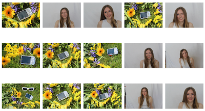
Contact sheet: Photoshoot


During this photoshoot I prioritised getting some images for my website (stories/images for audience interactivity and merchandise shots) as well as doing some test shots for some studio photographs to get used to the lighting because I don't have much experience with professional equipment.
The headshot photos I will not likely use because my model is either blinking, I positioned the camera wrong, or the lighting is slightly off, but they were a good opportunity for me to practise with the camera.
The shots with the camera prop and flowers are ones that I will decide between to encourage audience interactivity maybe through a photography competition - some of these picture may need cropping.
The tote bag shots were ones that I was practising for possible merchandise shots of a tote bag that I will edit a design onto.
Overall, I like some of these photos and am likely to use one of the camera and flower shots and possibly one of the tote bag shots, but I don't think I will be using any of the headshots.


These are some images that I took on my phone for test shots of possible images I could get outside. I really like the ones were she is looking directly into the camera with a natural smile. I won’t be using some of these images because the flowers are covering too much of her face or the background isn’t ideal, but I really like some of these images for either my website or the contents page.

Tuesday, 2 July 2024

Planning

Subject: Sophia

Costume: White tops, maybe floral, jeans

Props: Flowers, tote bag, maybe sunglasses

Makeup: Natural, maybe add highlighter


Production list:
- tote bag
- flowers


Inspiration for merch poses:


This pose is inspiration for showing my merch item of a tote bag, I really like the composition of the photo and how it can showcase the design on the tote bag whilst still clearly showing my model and the flower element that I plan to incorporate throughout my entire NEA in the magazine covers and contents pages as well as on the website


   This is my inspiration for my earrings merch. I like this            pose for similar reasons as to the image above, I love            how the pose draws attention to the product (earrings)            whilst upholding the recurring image of the flowers and            featuring models instead of only showing the product            because this enhances my theme of nurturing new artists,        by keeping models/artists involved in the imagery


Tuesday, 4 June 2024

Test shots

During half term I was unable to meet up with my models to take some practise shots, and the weather was not suitable to take the background images that I wanted to so I wasn’t able to get my test shots. Due to being unable to meet with my models because plans didn’t line up, I now understand the importance of planning ahead of time.


Ideas for poses for cover 1 (see pitch for inspiration photos):

- full body shot 

- sitting down

- slight side view?

- DIRECT ADDRESS


Ideas for poses for cover 2 (see pitch for inspiration photos):

- medium close up shot

- DIRECT ADDRESS


Ideas for inside pages/backgrounds:

- blue sky with clouds

- fields with flowers

- close up of flowers

- wide shot of field

- imagery with contrast

- consistent colour palette with front pages


Thursday, 23 May 2024

Pitch feedback

My feedback about what to add/improve from my pitch:
1. A name needs to be decided on for definite (Current options are Beat or Rhythm)
2. I need to think about what intertextual references to include and how to include them
3. I need to come up with ideas for digital convergence

My ideas from the feedback:
1. I am leaning towards the name ‘beat’ and possibly incorporating a play symbol in the masthead, or the name ‘fuse’ and involving imagery of a fuse into the name
2. For one of my magazines (one which I may lean into the pop genre for) I may make an intertextual reference to Sabrina Carpenter’s song ‘espresso’ because it fits in with the pop genre and the target audience demographic. For my other magazine (which may be inspired by R&B) I am planning on referencing another artist in this genre. I will convey this intertextuality through either cover lines, imagery, clothing, or background - possibly a combination of more than one of these
3. I am planning on developing a house style that I will adopt in both magazines and my website with a key colour or font referenced in all products, but with other colours creating some variety within the covers so they stand out from one another


First Drafts

Edition 1 First Draft:   Edition 2 First Draft: Website: